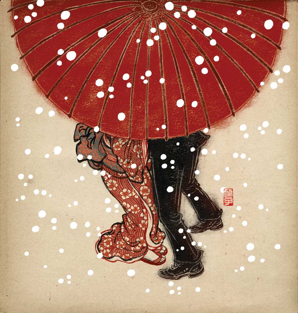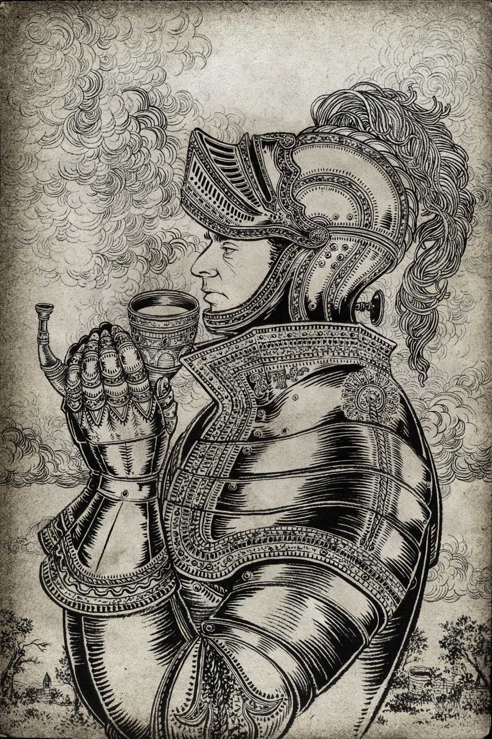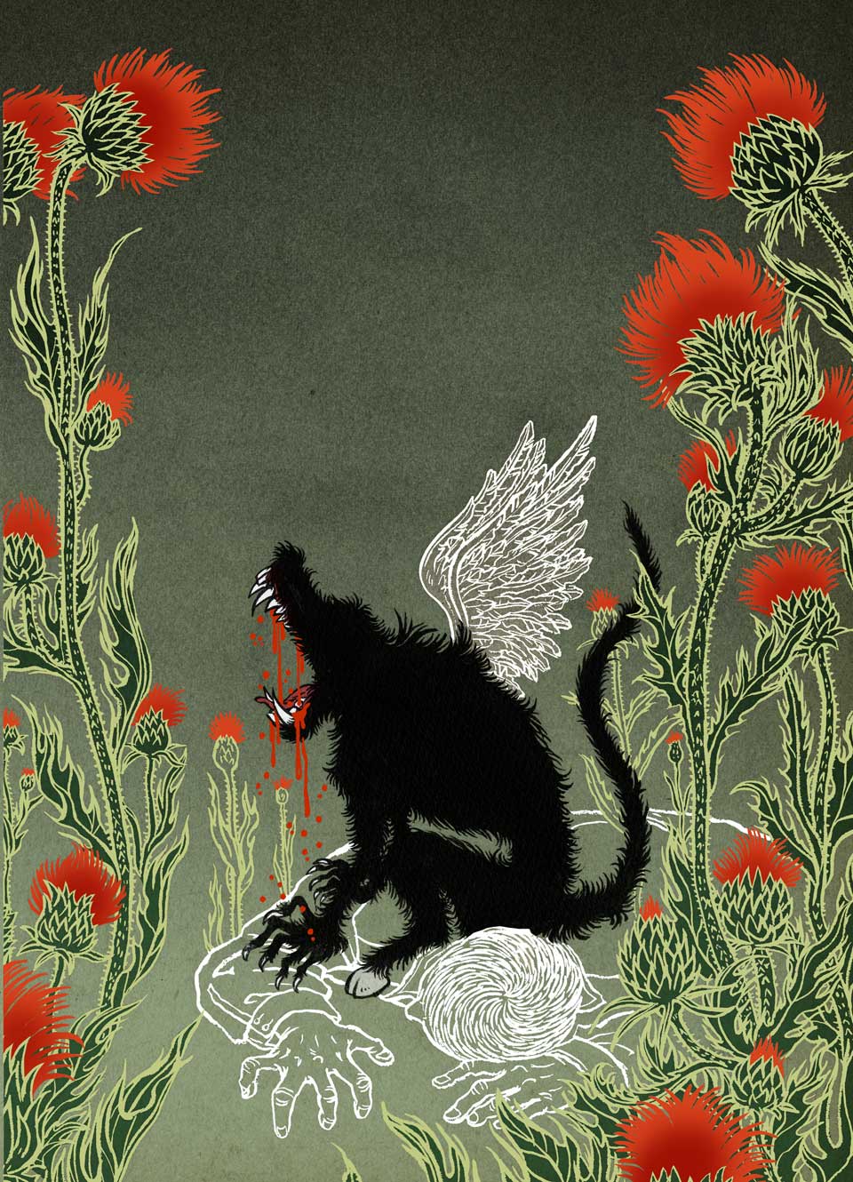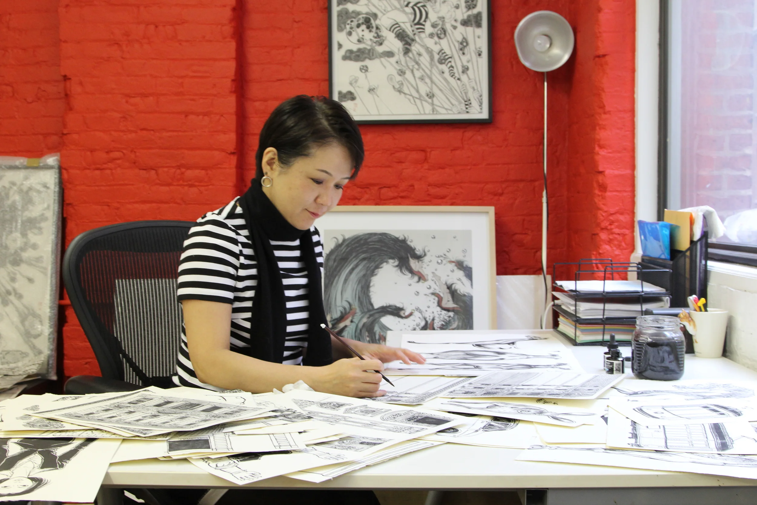


Yuko Shimizu is an award winning Japanese illustrator based in New York and instructor at the School of Visual Arts. She works with a wide-range of publishing, editorial and advertising clients. The intricacy and beauty which is suffusive throughout her extensive body of work is breath-taking. Please do not mix her up with another Yuko Shimizu. This Yuko did NOT create Hello Kitty.
Photo of Yuko by Giorgio Arcelli
Work by Yuko Shimuzu:
We Can’t Win Everything, But We Can Help Each Other - Yuko Shimizu at 99U conference 2016.
Yuko Shimizu nominated the graphic designer John Gall:
Last year, I think I read about 30 books. I love books. Probably my favorite pastime. There was only one book out of 30 I didn’t finish last year. And it had nothing to do with the book itself. It was actually a really good book. I probably will re-read it at some point. It just had a really really terrible cover, and I was dreading being seen with that book in my hand (though, I am sure, nobody on my subway car cared).
Don’t judge a book by its cover. Indeed. But covers are also the first introduction to the books. The first impression. walking into a bookstore is like going into to a party full of strangers and getting to know them for the first time. Sometimes, first impression is right, sometimes, getting to know more surprises us big time. But that first introduction is always important regardless. It’s similar to those who wear Nike or Adidas logo T-shirts, you want people to associate you with what you wear. Book nerds wear books as part of our identity. And covers do magic. The books we carry ends up becoming the first impression of us, those who carry them.
There are a lot of book designers who create amazing covers that make me wow at first sight.
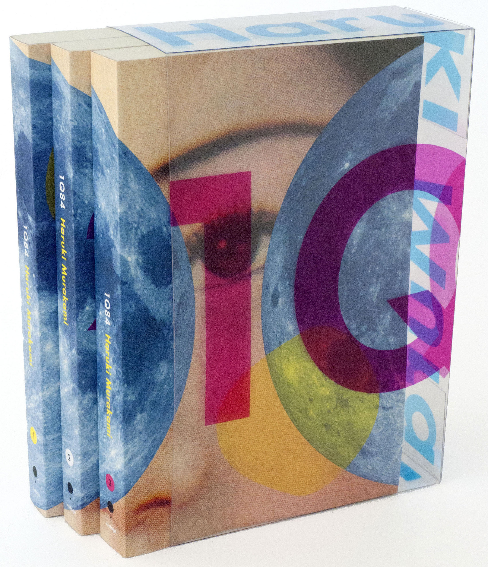
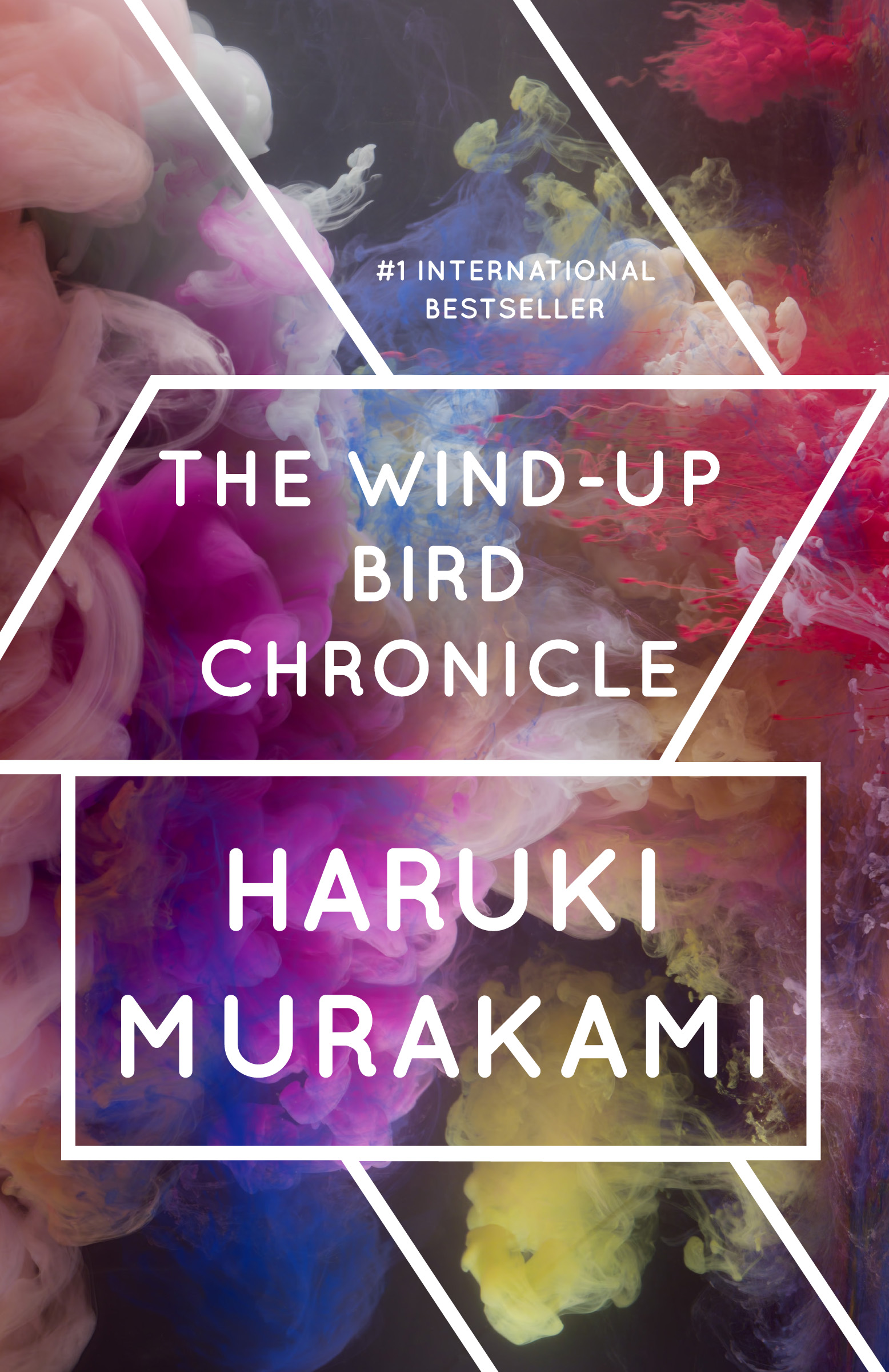
I chose John, because, you know, he is the one who did all those amazing Haruki Murakami book covers for Vintage Books!
“I chose John, because, you know, he is the one who did all those amazing Haruki Murakami book covers for Vintage Books! They are strange, mysterious and beautiful. They are also contemporary and nostalgic at the same time.”
They are strange, mysterious and beautiful. They are also contemporary and nostalgic at the same time. The first impressions capture the wold Murakami creates so vividly. I once told John that I wished original Japanese edition of Murakami books had as nice covers as those he designed.
I try not to judge books by their covers, then again, I walk into my local independent book stores, and the ones I pick up to check out are the ones whose first impressions speak to me strongly, asking me to pick them up. And, not surprisingly, many of those books I pick up, and those I end up purchasing are created by John.
(I was lucky enough to work with John once, for re-issue of Yukio Mishima’s Spring Snow (Vintage). Mishima is one of my favorite writers, and Spring Snow is one of his masterpieces. A favorite author’s favorite book with one of my favorite book designers. I was so lucky.)
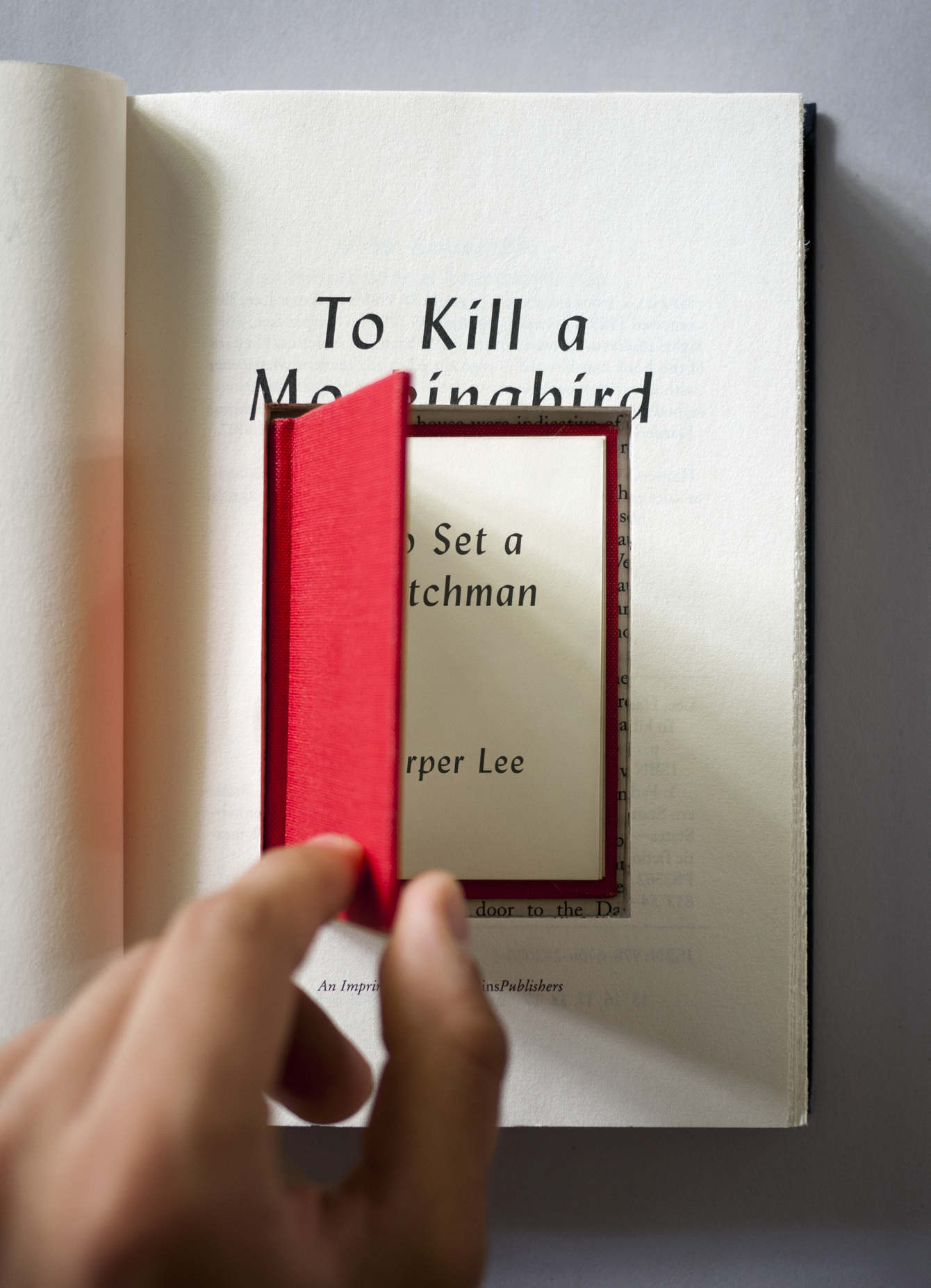
Work by John Gall:

John Gall nominated the photographer Jason Fulford:
Things I wouldn't know if not for Jason Fulford: the photography of Gus Powell, Ed Panar and Mike Mandel, the writer Daniil Kharms, or that Scranton, Pennsylvania has really good ice cream.
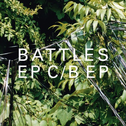
I think the first time I met Jason, he came to my office to show some of his photographs for possible use on book covers. I am pretty sure he arrived via motorcycle (All the while I’m thinking where do you even park a motorcycle in mid-town Manhattan). Of course his photographs were amazing and perfect for book covers since they were both specific and ambiguous at the same time—if that makes any sense. People have spent a lot of time trying to define Jason’s photos.
Little did I know then of his love for books, or that he would eventually go on to start his own publishing company with Leanne Shapton called JandL books where the publishing program seems to be to publish whatever it is that interests them. Or that he would be the one designing many of these beautiful books. Just for the love of it.
Our paths have crossed sporadically since that initial meeting, through projects and mailings (he sends the BEST mail), art openings and book signings. Though I often enjoy spending time with his photography, it is the unique specific/ambiguous world-view I find most inspiring. Why the hell not just hop on your motorcycle, ride out to Scranton and publish a book?
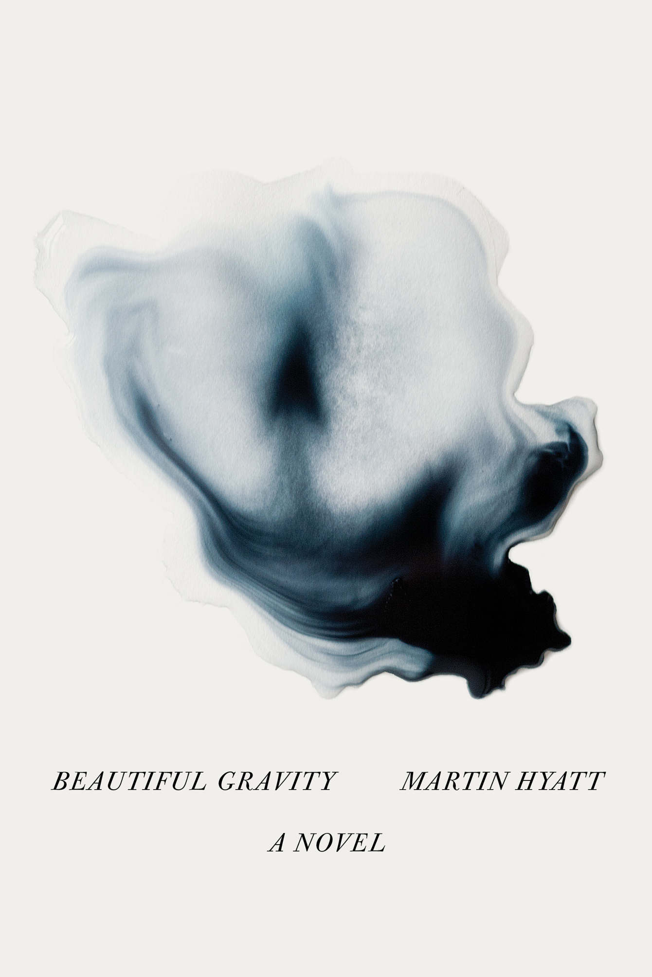
Work by Jason Fulford:

Jason Fulford nominated the Dutch artist Elisabeth Tonnard:
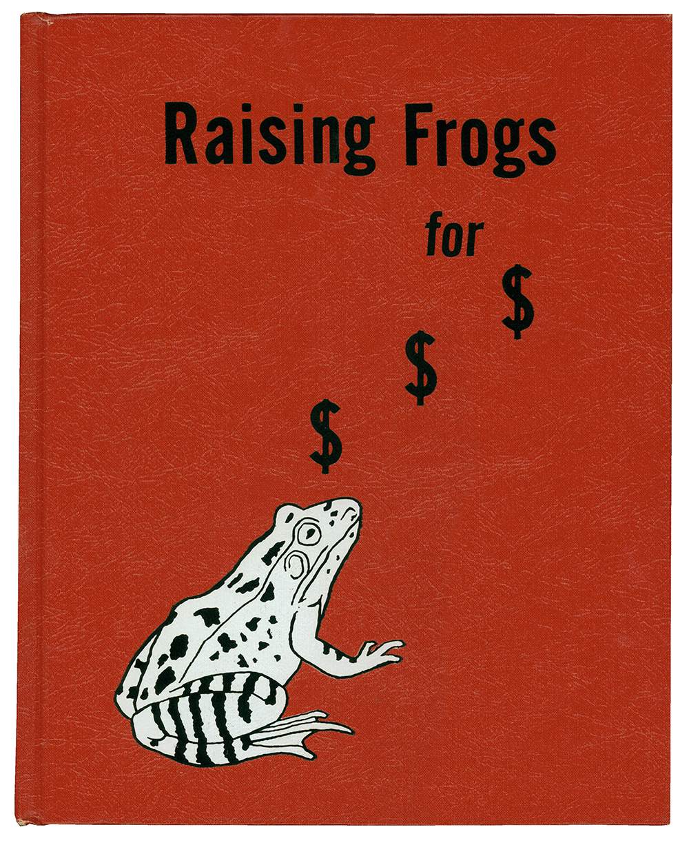
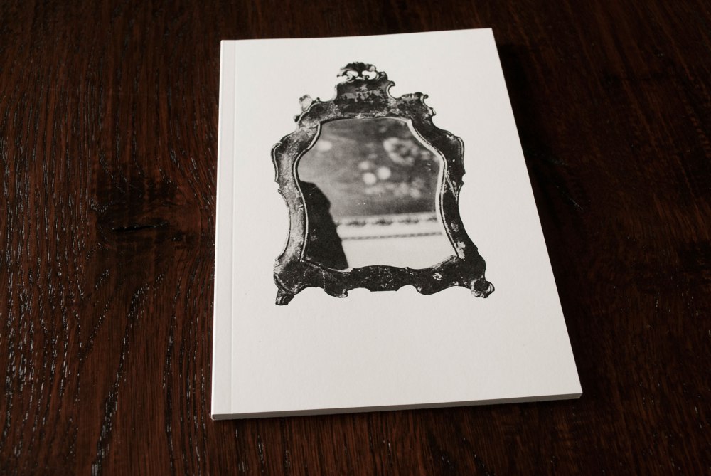
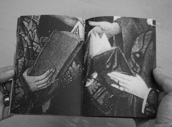
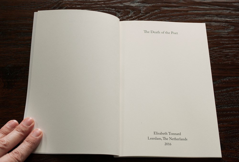
Elisabeth Tonnard is a Dutch artist who works mostly with appropriation. She is an artist-editor, an editor-poet. She makes books, at least a few every year. They often mash up found photography and literature.
She is rare, in that her ideas are often based on a gimmick, but the end result overpowers any gimmicky negative quality. The end results are almost always profound with a rich mix of cleverness and emotion, and sometimes a wink.
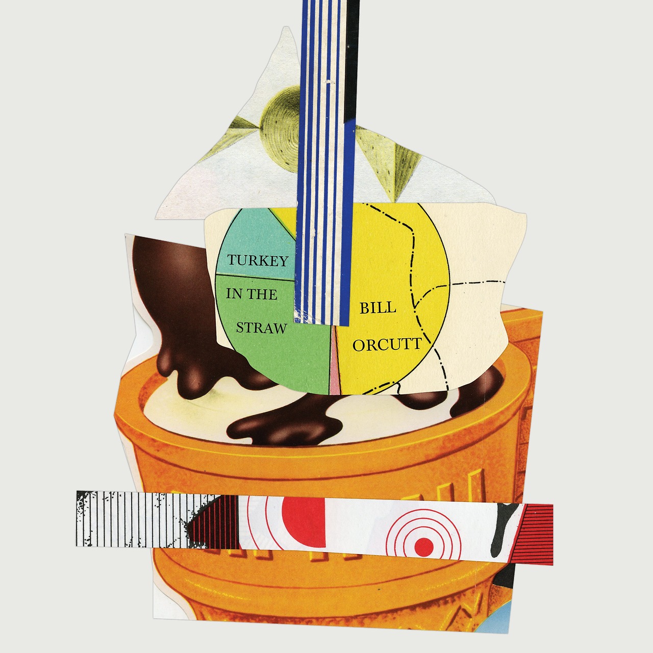
Work by Elisabeth Tonnard:

Elisabeth Tonnard nominated the artist Madeline Djerejian:
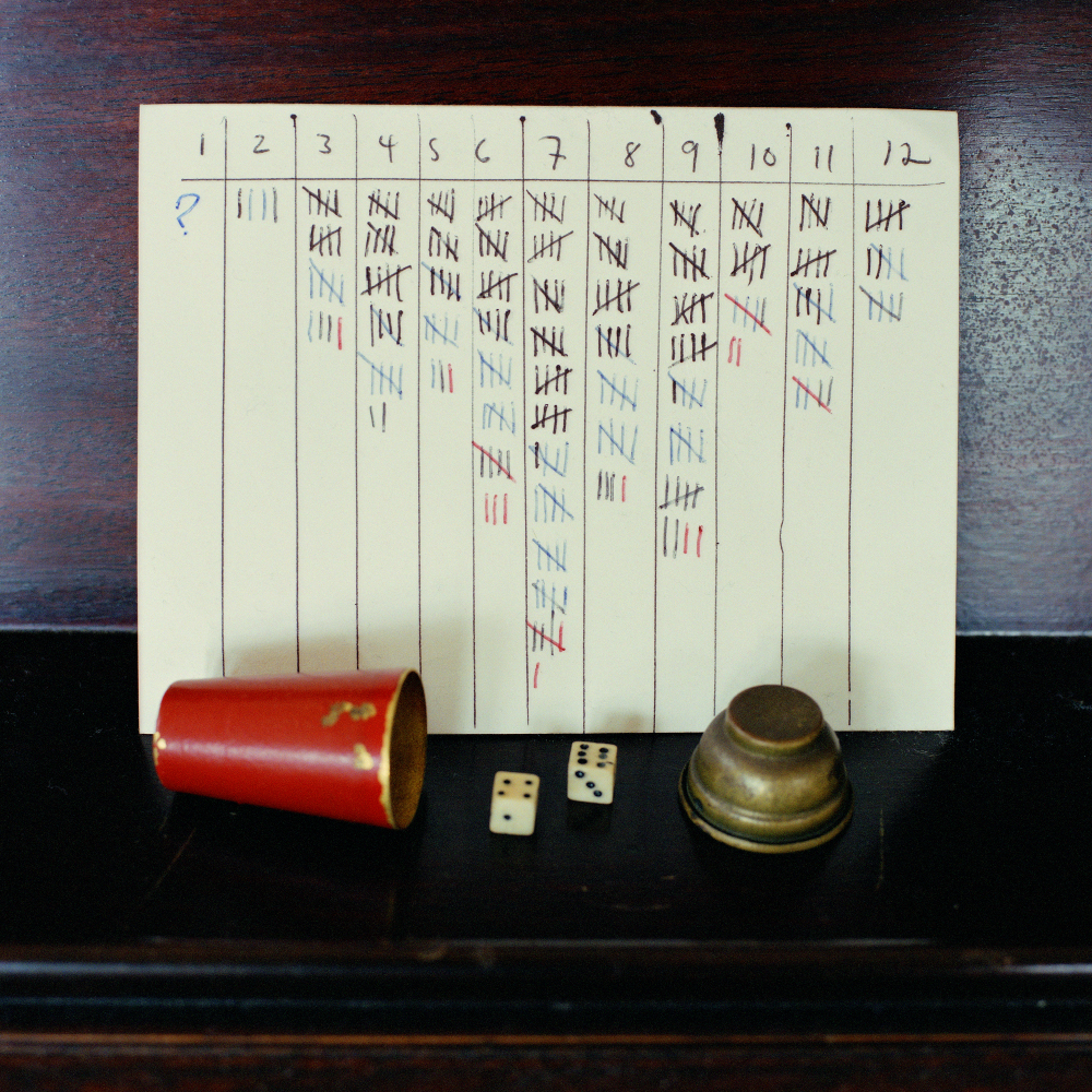
Madeline maintains a lively practice creating suggestive works that are often based on image-text connections. To me it is interesting that her projects are of a conceptual nature while also hard to pin down, they constantly invite further exploration because they cannot be captured into one-liners. The works are never obvious. It is the oeuvre of a thinker. She uses unexpected combinations, such as in 'decima campesina' a video in which text from a love letter is juxtaposed with photographs taken by her father in Kuwait in June of 1991. Everywhere the viewer is left to form his or her own conclusions, for instance in the really exemplary project (also because it is small and unassuming, and thus rare) 'Wordsworth at Arlington' which is simply about a text encountered on a gravestone of a soldier who died in recent battle. The juxtaposition here is to the Wordsworth poem that the text came from. Such loving, caring works the world could use more of.
Madeline also runs the salon 1@111 together with Rachel Gugelberger. I was happy to be a guest speaker for it in 2014. Artists, writers and curators are invited to share their work process in an intimate setting. It continues an old humanistic tradition right in the heart of NYC.
Work by Madeline Djerejian:
The Last of Beirut weaves together text and image to construct a contemplative vision of displacement and loss on the eve of civil war in Lebanon in 1975.

Madeline Djerejian nominates Brooklyn-based artist and writer James Walsh:
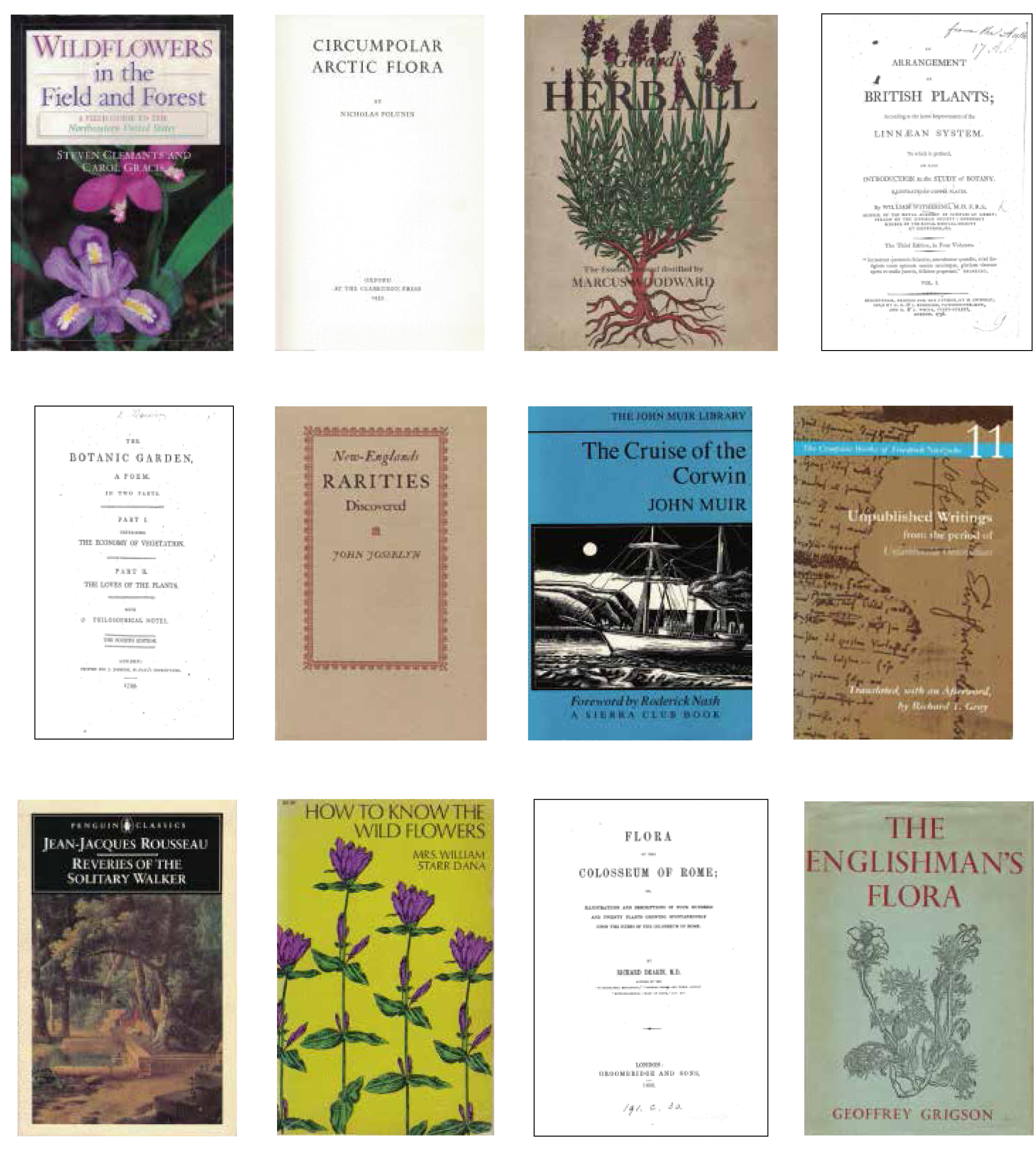
James is an artist and writer - yes. He’s also an ambulist, a botanist, a letter-writer, a letterpress printer, a gleaner, a humorist (of the dry variety), and more. His love of books, the deft way he layers his enthusiasms into his work, his dedication to the hand-made - these are all qualities that are inspiring to me.
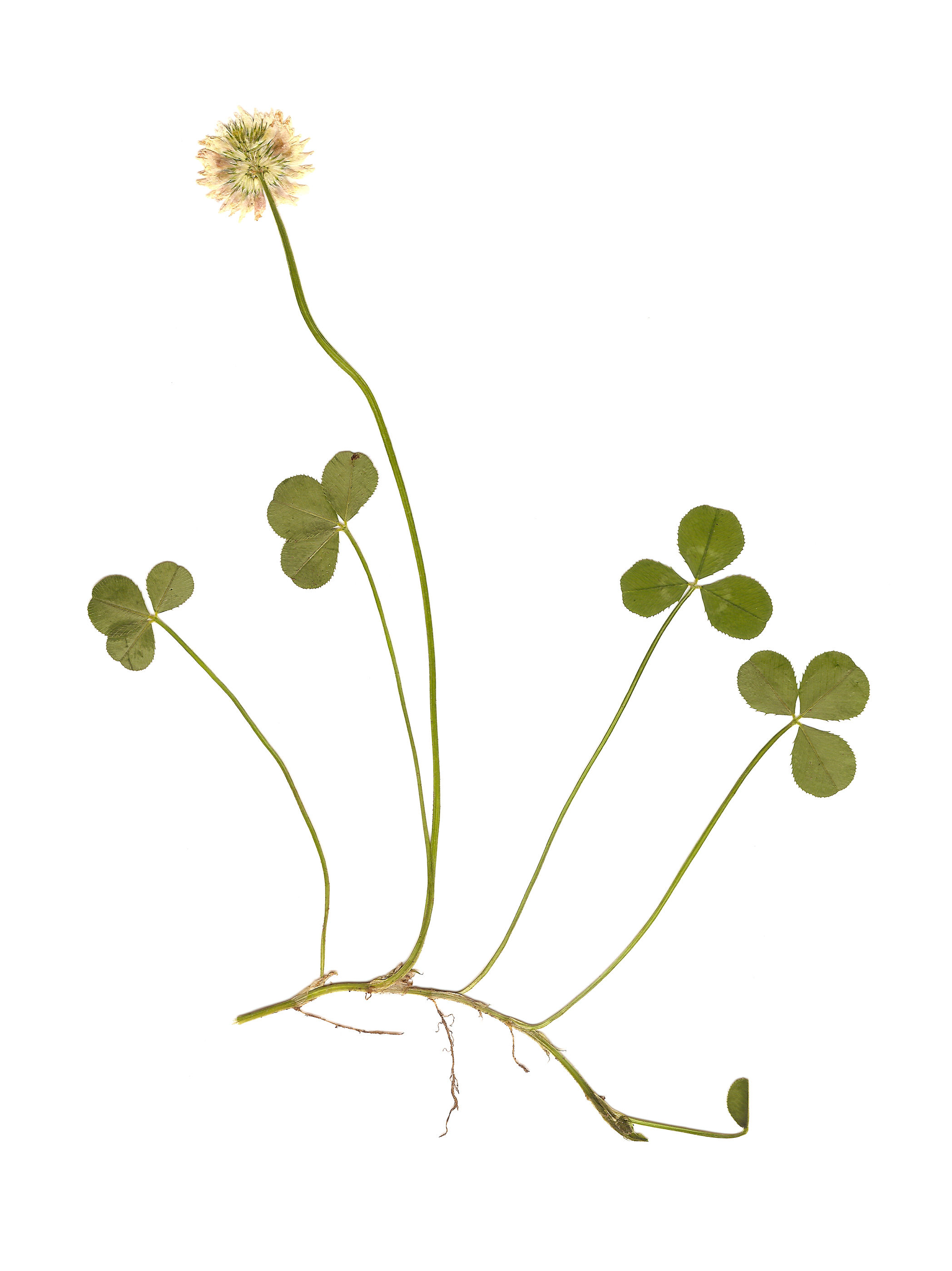
His latest artist book, The Arctic Plants of New York City, is a truly gorgeous object. Rich with word and image, it has a simplicity that is deceptive: each copy of the edition presents carefully researched natural history alongside prose essays, poetry, quotations, and personal letters, yet each is unique in containing numerous pressed plants he unearthed in the city’s parks or simply in the cracks of sidewalk pavements.
“James is an artist and writer - yes. He’s also an ambulist, a botanist, a letter-writer, a letterpress printer, a gleaner, a humorist (of the dry variety), and more. ”
James and I are friends, so I like to tease that he’s both ‘creator and destroyer’ because all the plant forms in his work met death at his hand. Pressing plants is never easy; I know James felt loss on those rare instances he failed in this task. But to see his successes – demure arctic flora such as Trifolium repens (White Clover) or Galium aparine (Cleavers) – delicately splayed across an expanse of white pages is to recognize and celebrate the beauty of the survivor. I love that James has endowed these silent, desiccated forms with an uncanny life far beyond that which Nature herself would have allotted them.
Madeline Djerejian
New York City, 2016
Work by James Walsh:
Search for areas of interest here (eg. illustration, fashion...)
