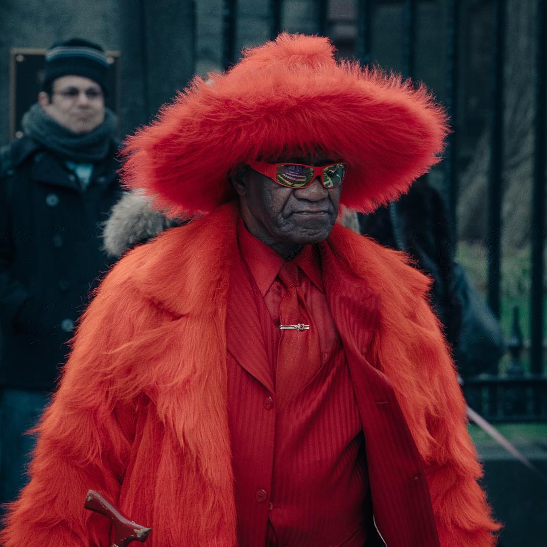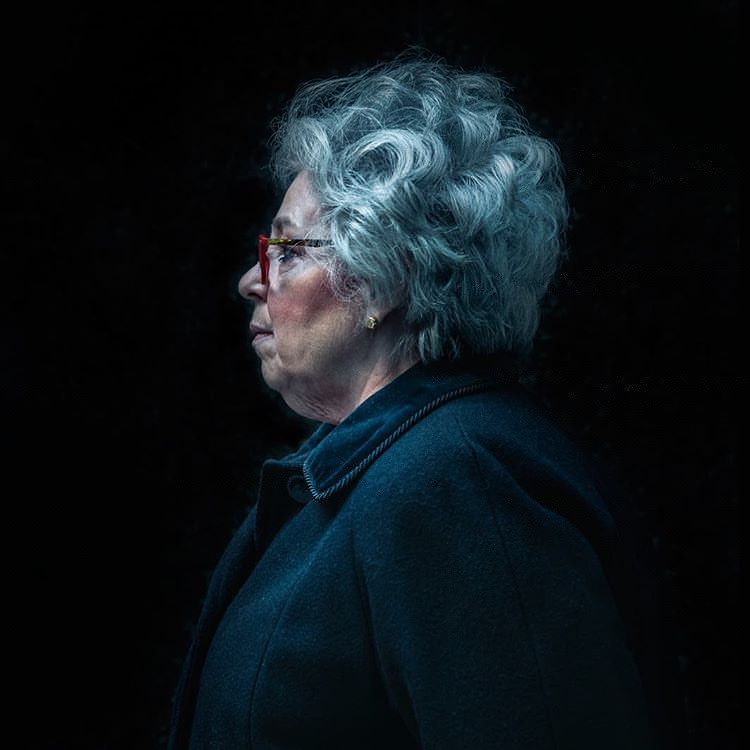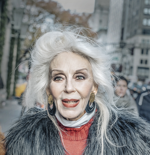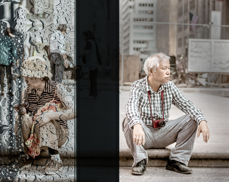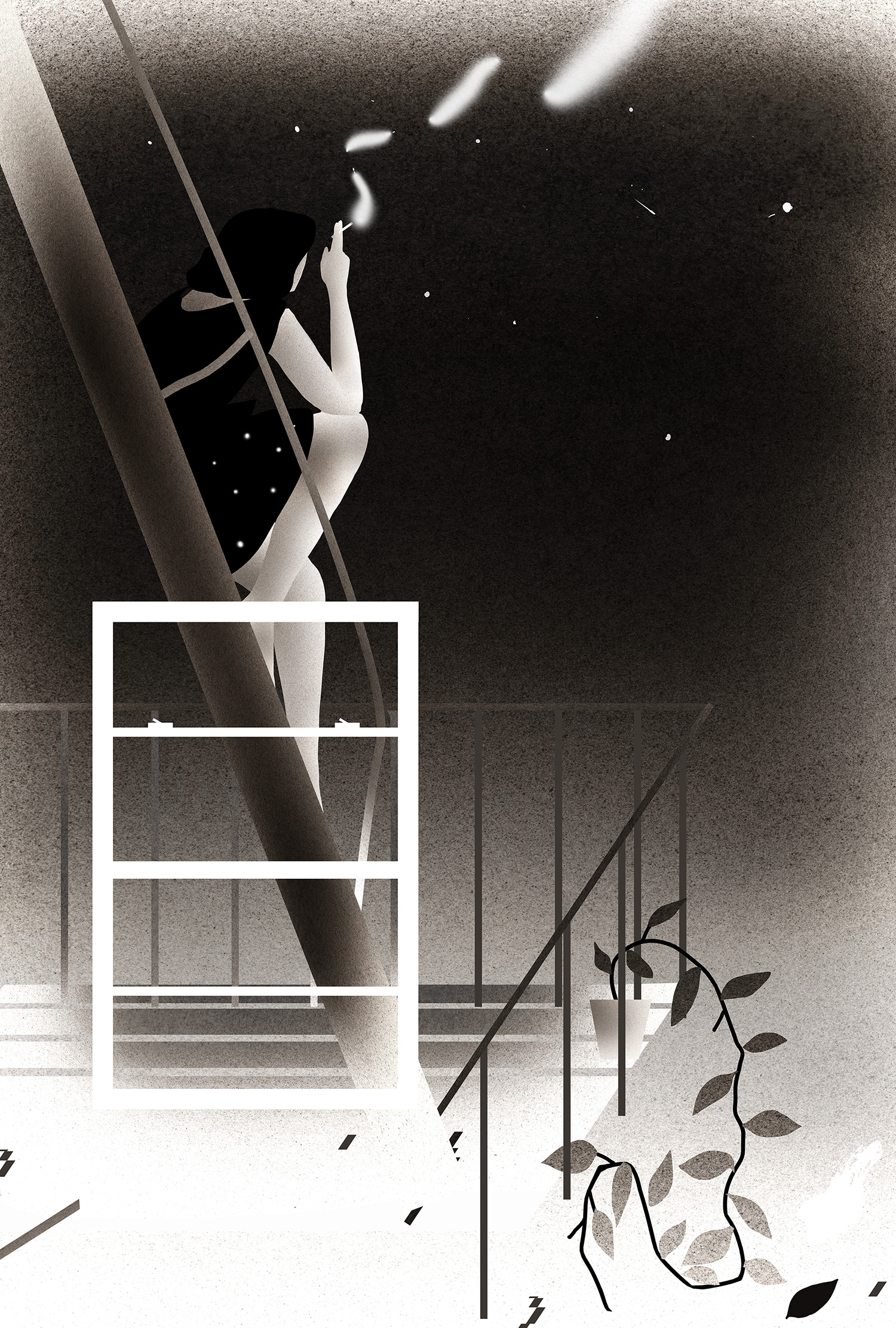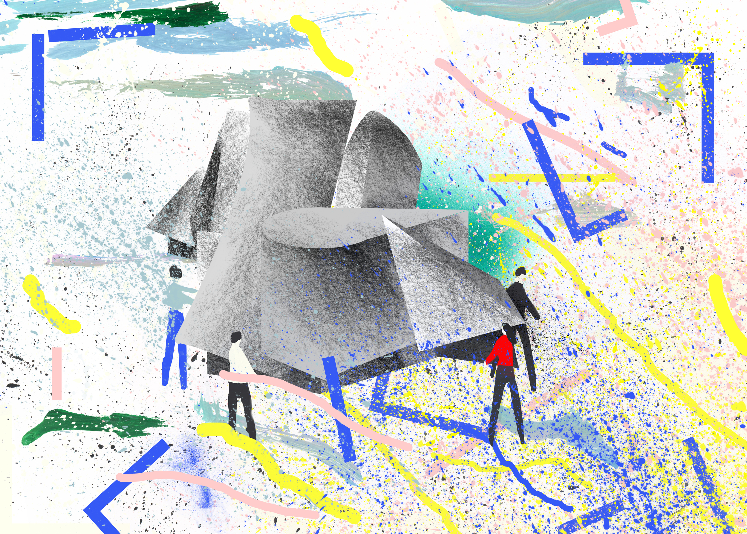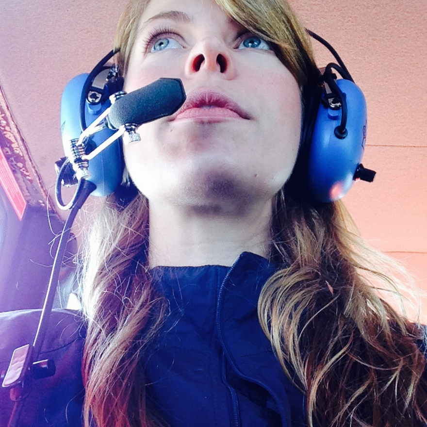


Daniel Featherstone is a photographer and graphic designer equally at ease capturing the street inhabitants of his adopted home city New York or working on campaigns for international brands. A former art director for Ralph Lauren, Featherstone currently lectures in the Parsons School of Design and is a consultant with Nautica. We're honoured to have him lead our new thread of inspiration.
Work by Daniel Featherstone:
Daniel Featherstone nominated the artist Tim Ward:
I met Tim a couple of years back when I happened upon an unassuming gallery in the sleepy town of Hasting-on-Hudson. His work stood out from the stifling clichéd environmental photography and watercolor landscapes and presented itself as fresh and challenging.
“I was immediately attracted to Tim’s elegant use of symmetry, space and juxtaposing colour. ”
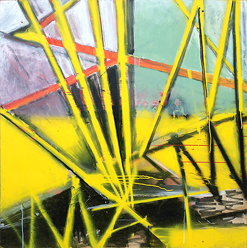
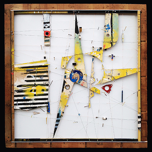
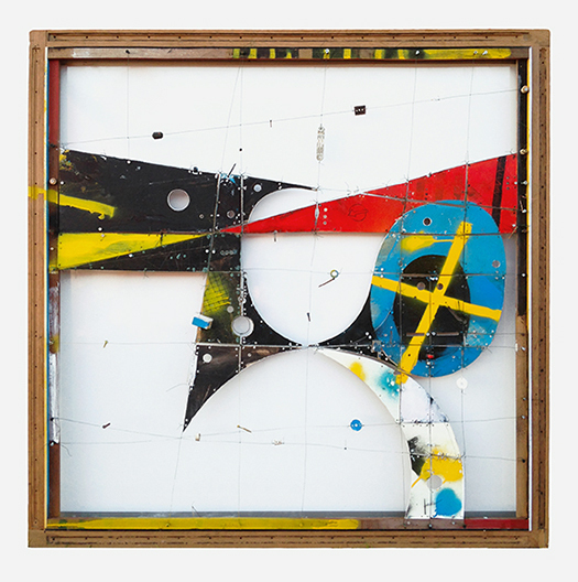
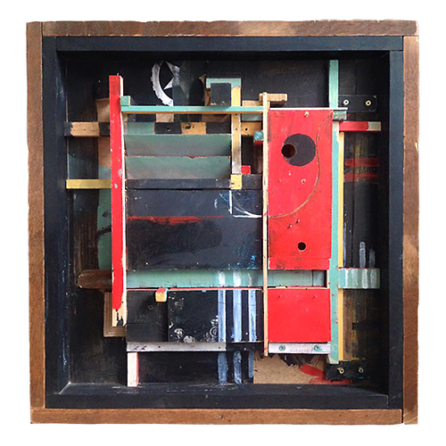
The intricacies of the pieces of wood hinged with aluminum and string drenched in a thought-out graphic color palette almost felt like a miniature theatrical performance. My background is in graphic design so I was immediately attracted to Tim's elegant use of symmetry, space and juxtaposing colour. I can feel his process is an organic one and has a sense of exploration in rhythmic movement and three dimensionality.
Work by TB Ward:

TB Ward selected the artist Mark Entwisle as his current source of inspiration:
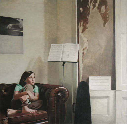
I find it difficult to ignore artists who can draw. It’s a skill that many may assume is foundational, but my fellow artists will admit it is not. There’s a romance in the idea of artists who carry around a beaten up sketchpad and a couple of pencils in their coat pockets, ready to document any given thing that they see and find of interest. And then, when they can do it well, well, I’m hooked. Mark is one of these artists. He has an innate ability to capture moments that would perhaps pass many of us by. His on the spot drawings, wonderfully twisted photographs, and subsequent paintings, deal with light and reflection, and the transforming of the mundane and everyday to the vital and precious. His observational creations become a unique and evocative language that seems able to heighten my awareness of the passage of time.
Work by Mark Entwisle:

Mark Entwisle nominated the artist Keniche Hoshine:
I discovered Keniche Hoshine's paintings on the internet a few years ago and we have since become instagram and tumblr friends. He is very open and generous and his work has been a great inspiration to me.
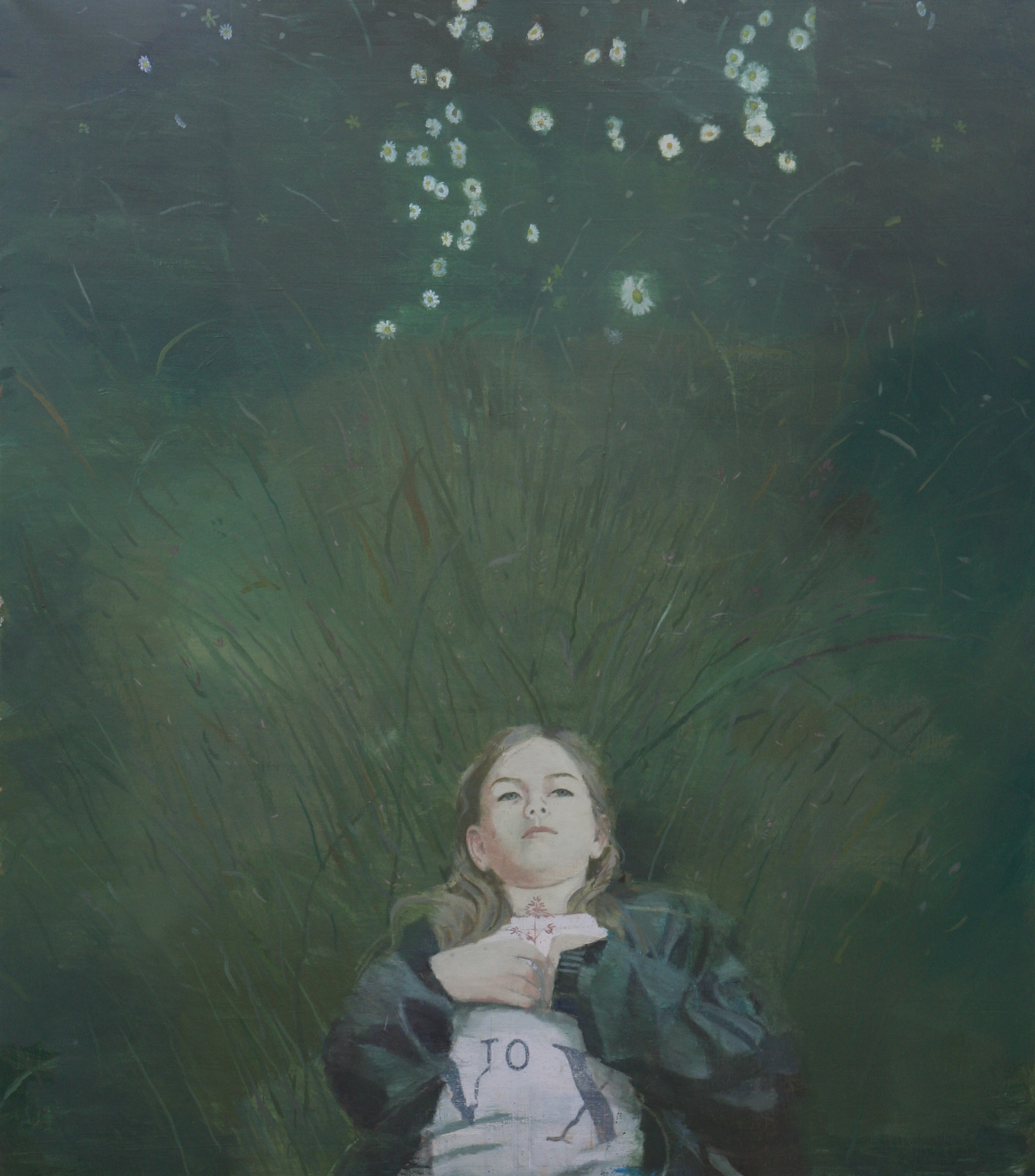
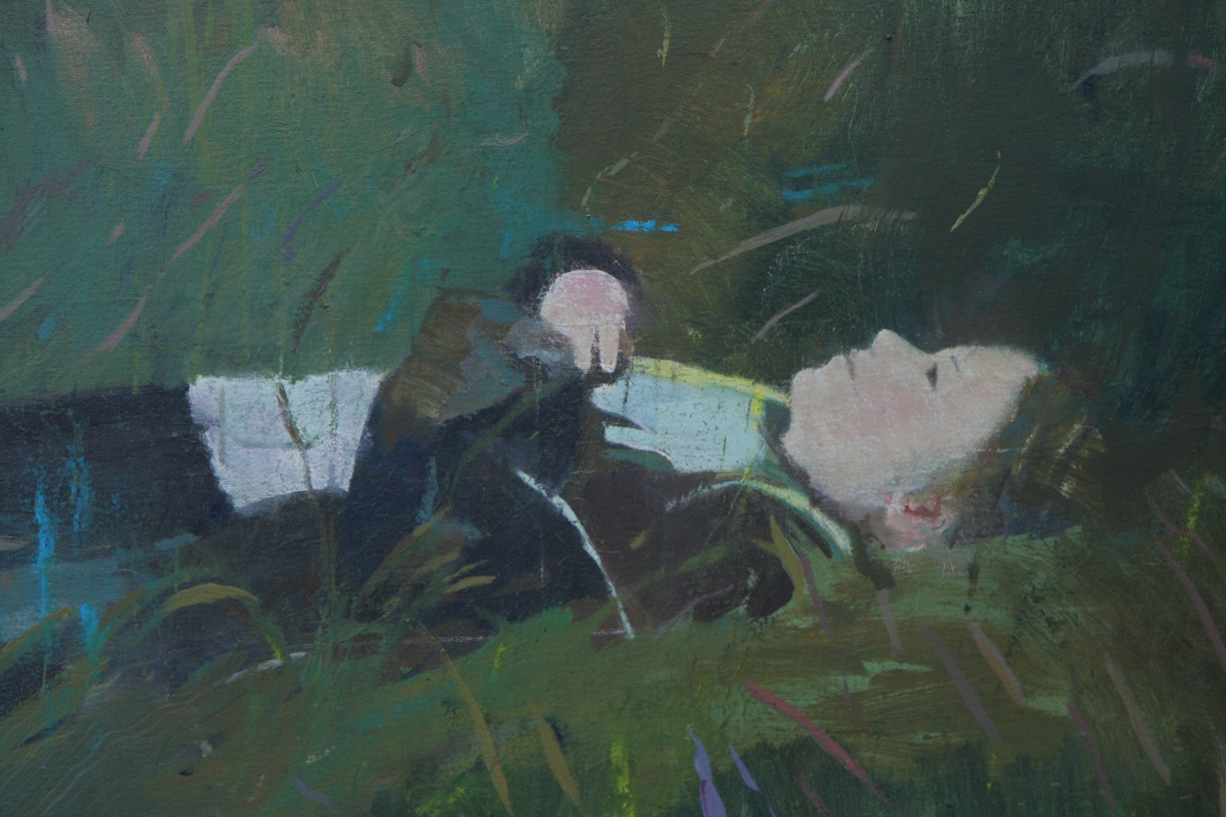
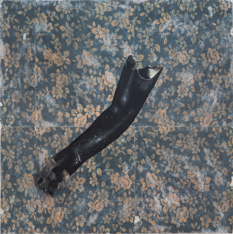
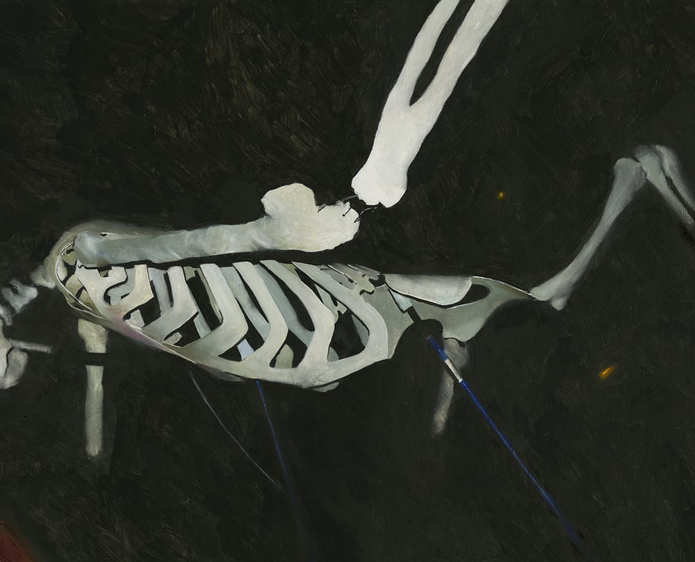
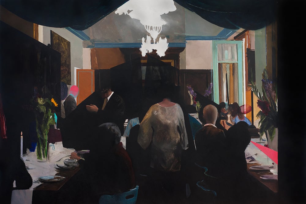
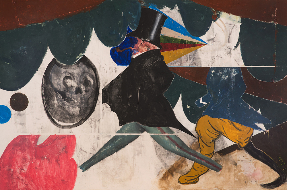
His paintings are small in scale, using a mix of oil, acrylic, paper, ink and wax on wooden panels. he creates exquisite passages of figurative painting that are juxtaposed with and partially obscured by swathes of thick black or white paint and transparent glazes that are often scraped back and scored. He paints with a wonderful balance of clarity and obfuscation, control and chance. Faces and limbs appear to emerge from or dissolve into their surroundings.
“Heavy with melancholic atmosphere and implied narratives, they seem like damaged stills from an unknown film, that have begun to deteriorate.”
I was attracted by the sense of impermanence and mystery that pervades. It's not at all clear what is happening or what they are about and that is what i like about them. Heavy with melancholic atmosphere and implied narratives, they seem like damaged stills from an unknown film, that have begun to deteriorate.
Work by Kenichi Hoshine:

Kenichi Hoshine nominated artist and illustrator Jon Han:
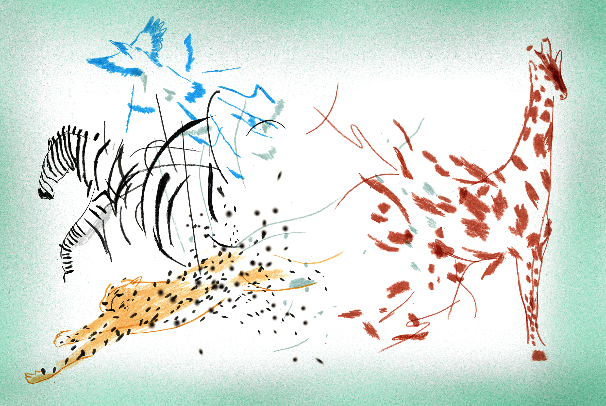
"He's a little scary." a student told me with a slight chuckle. She was talking about Jon Han after his first class as an instructor at Pratt Institute in Brooklyn. The statement is quite funny because it couldn't be further from the truth. He's one of the nicest guys I know, and not only that, one of the most talented. With his work, Jon is constantly pushing the boundaries of illustration and design and is making us realize what can, and should be, accepted. Often times incorporating the ethereal and the intangible, the pieces that Jon creates always make me pause to ponder them for several minutes. Familiar scenes will be shattered by acid colors and abstract mark-making. The cosmos will be imbued with a somber tone. Anxiety will give way to serenity. Jon will navigate you through his universe and kick you out at the other end, leaving you utterly confused, in the best possible sense.
Work by Jon Han:

Jon Han photo credit: Jerm Cohen
Jon Han selected the graphic designer Keetra Dean Dixon:
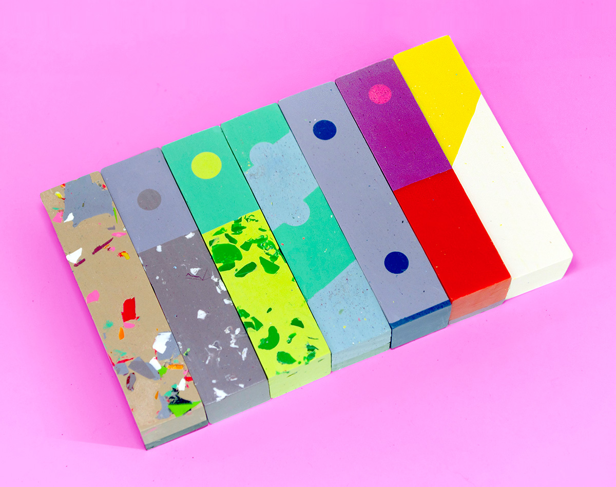
The first time I came across Keetra's work was a lettering piece she did for the New York Times. I was immediately impressed by how unique, bold, and opinionated her work was. It was like a breath of fresh air. I dug deeper into the different types of projects she's done and was truly inspired by the fact that her work and thought process didn't seem bound by mediums, traditions or rules. There is this sense in her work of ease, confidence and clarity.
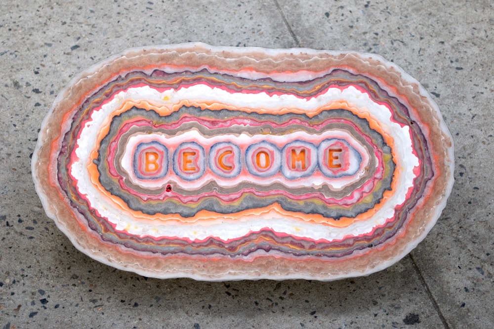
Keetra Dean Dixon and her work (Become is a collaborative work with her partner JK Keller):
Search for areas of interest here (e.g. fashion, print, installations...)

